
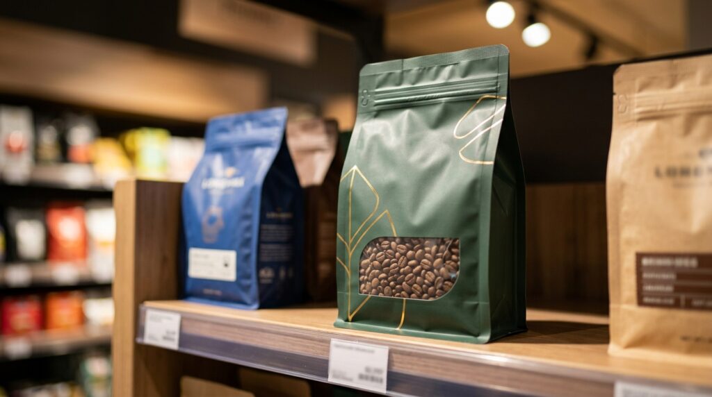
Effective stand up pouch design combines shelf visibility, structural durability, and cost efficiency to drive purchase decisions within the 7-second window shoppers use to evaluate products, according to NielsenIQ research. Stand up pouches now account for over 18% of North American flexible packaging sales and grow roughly 7% annually, per Smithers Pira. Premium print finishes can lift sell-through by double digits versus generic bags, while well-designed pouches must remain readable from 1.5 meters and survive 18+ months of shipping.
Thoughtful stand up pouch design is really what separates a quick 2-second glance on the shelf from someone actually dropping it in their basket. It comes down to the right shape, the right barrier film, and how it all comes together.
And the print finish can actually boost how well a product sells by double digits compared to a plain generic bag off the shelf.
At GCLPacking, after making custom pouches for over 600 consumer brands since 2015, we keep seeing the same pattern play out. The winning designs aren’t the prettiest ones, honestly.
They’re the ones built around how the pouch sits on the shelf, how it feels in your hand, and how quickly a shopper’s eye picks it up. This guide breaks down the choices that actually move units off the shelf.
Quick Takeaways
- Design pouches readable from 1.5 meters to capture 7-second shopper decisions.
- Choose barrier films ensuring 18+ months of shipping durability without failure.
- Invest in premium print finishes to boost sell-through by double digits.
- Balance shape, structure, and cost—failing one undermines the other two.
- Prioritize shelf visibility, hand feel, and quick eye-catch over pure aesthetics.
What Makes a Stand Up Pouch Design Win Shelf Space
A strong stand up pouch design really does three things well at the same time. It needs to be seen from a distance of about 1.5 meters.
It has to hold up structurally for over 18 months of shipping and handling. And it must have a unit cost that lets you keep your profit margin.
If it fails at just one of these, the other two don’t really matter much anymore.
Research from NielsenIQ shows that shoppers make up their minds in about 7 seconds. They decide whether to pick up your pouch or not in that short time.
So every design choice has to fit into a clear priority. Think of each decision, like the shape, the finish, the closure, and the film layers, as a vote for one of these three goals:
- Visibility: This is about the silhouette, how colors are blocked, whether you use a matte or a gloss varnish, and making sure the brand mark takes up about 30% of the front panel.
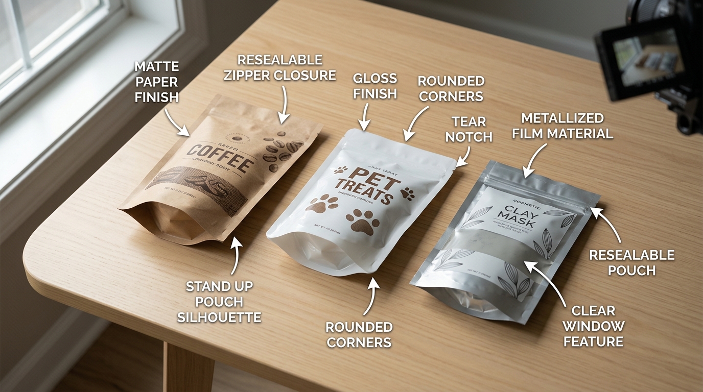
- Unboxing experience: This covers where the tear notch is, how the zipper feels, if it reseals properly, and the reveal when it’s first opened.
- Cost per unit: This involves the film gauge, the number of print colors since each spot color can add around $180 to approximately $350 to the plate cost, the minimum order quantity tier, and how complex the gusset is.
Here’s the trap. It’s basically impossible to maximize all three at once.
If you go for a 9-color rotogravure pouch with a holographic window and a child-resistant zipper, you’ll win on visibility and the unboxing experience. But then the price will likely push your product out of a comfortable approximately $4.99 shelf slot.
At GCLPacking, when we get a brief from a coffee brand, the first thing we ask is which of these three outcomes comes first for that specific product’s category and price point. Honestly, that single answer decides about 80% of what goes on the expected level sheet.
The rest of this guide will walk through each decision with that priority in mind. For a broader look at suppliers, you can check out our 2026 stand up pouches manufacturers guide.
Pouch Shape, Gusset, and Size Decisions Mapped to Shelf Outcomes
Direct answer: Pick the gusset based on how the retailer merchandises your category. Flat-bottom, also called box pouch, gives you the widest facing and stands up on its own without any help. That makes it really good for coffee and premium pet treats.
K-seal gives you the widest face-to-depth ratio per dollar spent. It’s ideal for snacks on pegboard hooks or shallow shelves. Round-bottom, the doy-style one, is the cheapest option though it tips over once you go above 250g of fill, so honestly just reserve it for hanging displays.
Gusset-to-shelf-outcome matrix
| Gusset Type | Best Fill Range | Facing Width | Typical Category & Planogram Slot |
|---|---|---|---|
| Flat-bottom (5-panel) | 227g–454g (8–approximately 16 oz) | 90–approximately 140 mm | Whole bean coffee, approximately 102 mm shelf depth slot |
| K-seal | 56g–170g (2–approximately 6 oz) | 110–approximately 160 mm | Snack aisle pegboard, approximately 76 mm deep slot |
| Round-bottom doy | 85g–227g (3–approximately 8 oz) | 100–approximately 130 mm | Pet treats, hanging hook or basket bin |
Here’s one stat worth memorizing. Standard US grocery shelves run 305 to approximately 406 mm deep, but the visible planogram slot, basically the spot each product gets, is usually only 76 to approximately 102 mm wide per SKU.
When you factor in a pouch wider than approximately 140 mm, the co-packer has to drop your facings from 3 down to 2. That’s a approximately 33% loss in shelf share, gone just like that.
Take a look at the FMI Food Industry Association resources on category management for slot data.
Over at GCLPacking, we actually run dimensional samples on the kind of shelf fixtures retailers expect, and we do it before tooling ever starts. Most stand up pouch design errors we catch are only 5 to approximately 10 mm too wide.
But that little bit of extra width costs the brand a facing it never recovers. 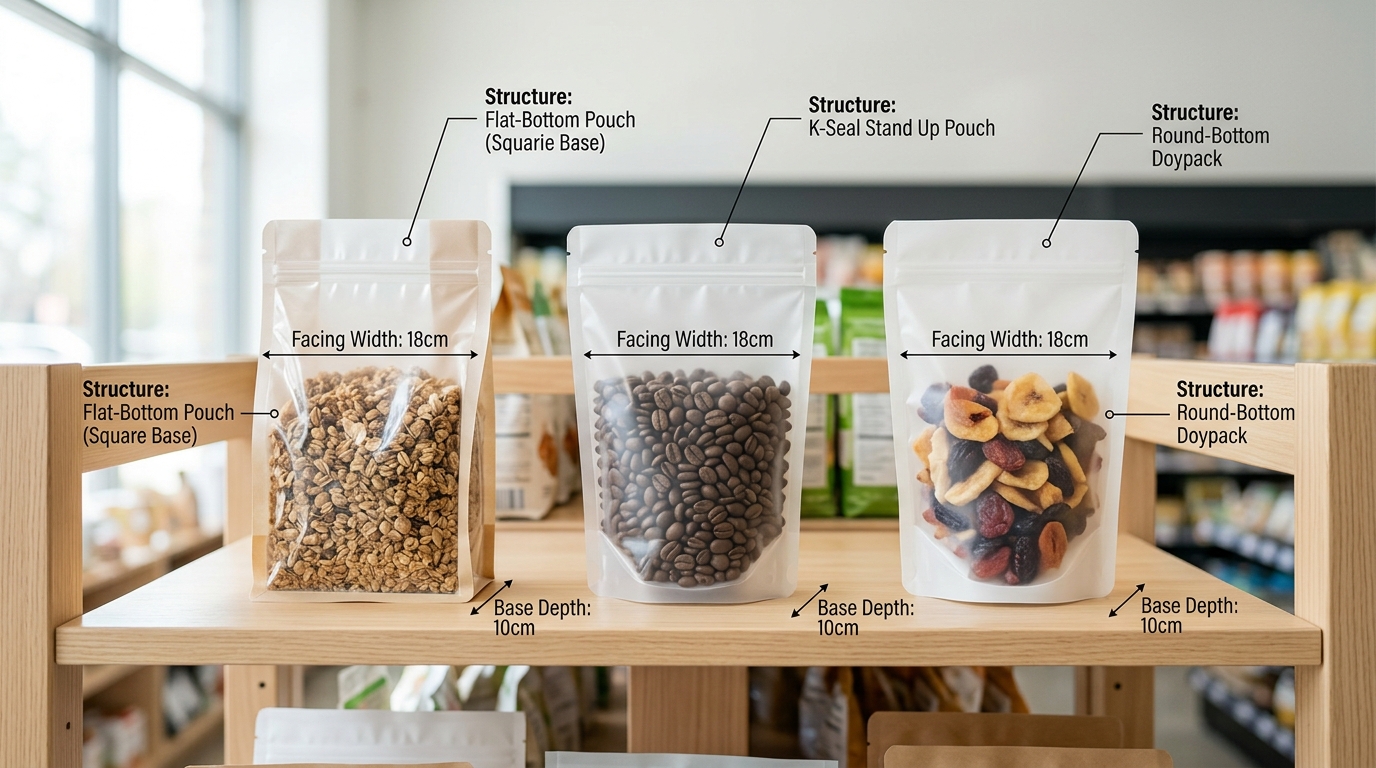
Material Structures and the Sustainability vs Print Quality Tradeoff
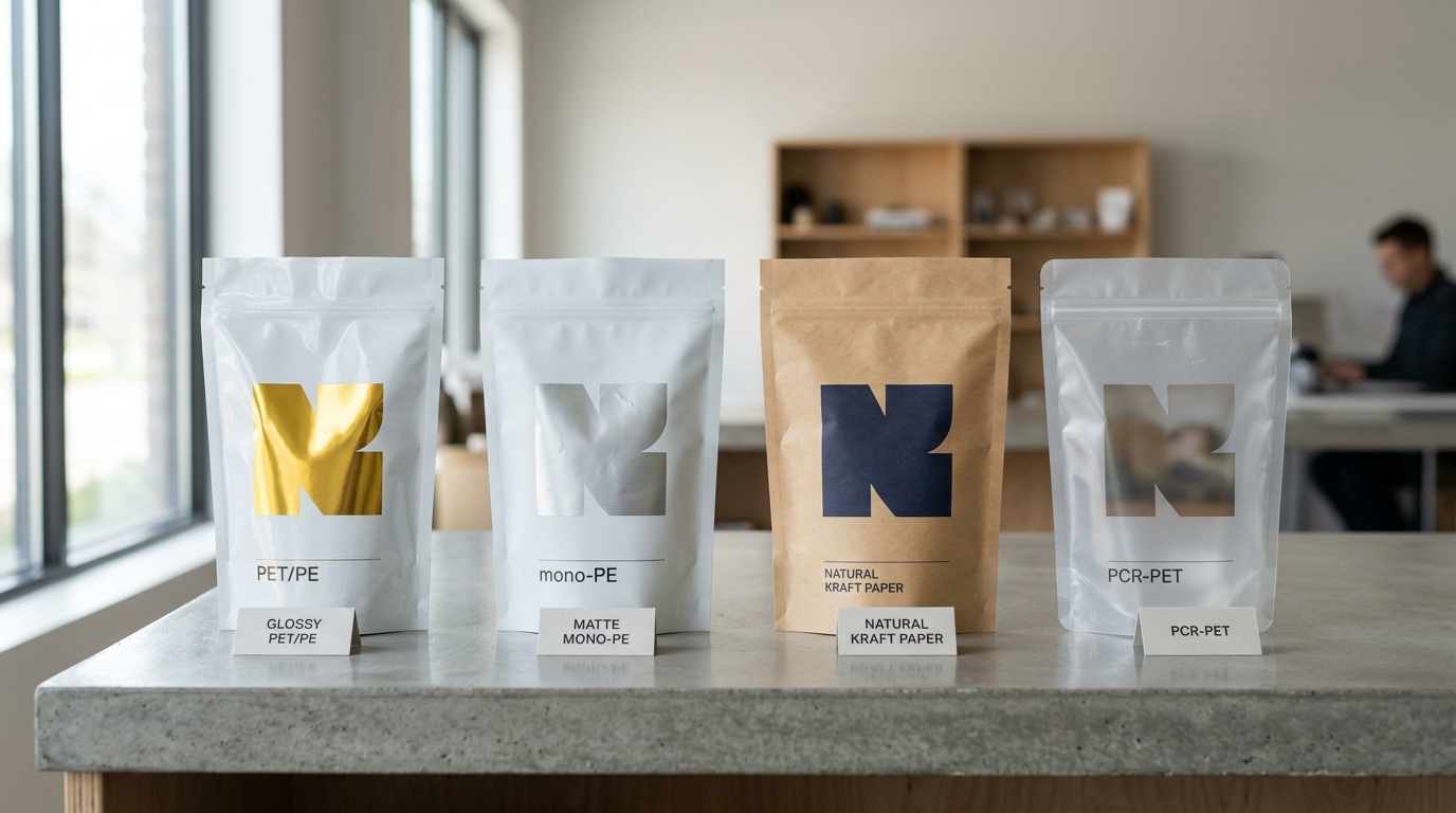
The simple answer: PET/PE laminate still gives you the sharpest prints and keeps your product fresh the longest. Mono-PE is usually the cheapest way to get a recyclable pouch, though it makes metallic inks look dull. Kraft paper will make your dark colors look 20 to approximately 30% less vibrant.
And films with recycled content, or PCR, add 8 to approximately 15% to the cost per pouch. They also cause the most rejects during quality checks. You really just have to decide what your brand needs to look like on the shelf.
Four structures compared on what actually matters
| Structure | Ink vibrancy (Delta-E vs PET/PE) | Barrier life | Recyclability | Cost / 1,000 (approximately 8oz pouch) |
|---|---|---|---|---|
| PET/PE laminate | Best you can get | 12-18 months | Not accepted in most curbside bins | approximately $240-310 |
| Mono-PE (recyclable) | Colors shift a bit; metallic inks lose shine | 9-12 months | Store drop-off only, How2Recycle approved | approximately $265 -340 |
| Kraft paper / PE | Dark colors get 20-approximately 30% duller; no true black | 6-10 months | Mixed materials; almost never accepted | approximately $290 -360 |
| PCR-PET / PE (approximately 30% PCR) | A little hazy, colors slightly off | 10-14 months | Lets you say “recycled content” | approximately $280 -370 |
A lot of guides on stand up pouch design forget to mention two things. First, kraft paper fights you on dark colors.
The brown paper soaks up some ink colors more than others. So a Pantone black often prints as a warm, dark gray.
That is just how it is.
Second, mono-PE has trouble with metallic inks. The single-layer film doesn’t hold the shiny pigment as well. Silver and gold designs can look flat. If your logo is supposed to be chrome, honestly, it will look disappointing under bright store lights.
At GCLPacking, we actually run test prints on the material you pick before making the final plates. I’ve seen that about one in four brands switch to a different material after seeing their own artwork printed on kraft next to PET.
If you want to find a good supplier, our 2026 manufacturer guide can help you ask the right questions.
And you should really check the EPA recycling guidance before you put any “recyclable” claim on your package.
Finish, Window, and Closure Choices That Shape Unboxing Experience
Direct answer: Match the finish to whatever signal your product category sends, put the see-through windows where your product looks best in a photo.
And choose closures based on how often a buyer will actually reopen the bag. Get any of those three wrong and even a gorgeous print job will still lose you the sale.
Lamination: pick the cue, not the trend
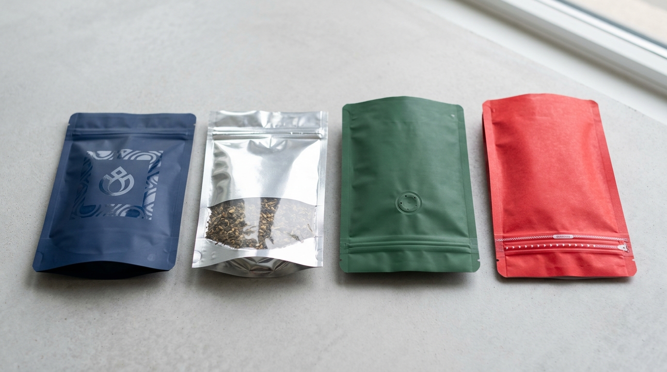
- Gloss BOPP is the shiny finish that really saturates color and reads as “fresh and bold.” It is the default choice for snacks, candy, and pet treats.
- Matte BOPP feels premium and calm. Use it for specialty coffee, loose-leaf tea, or supplements. Pair it with spot UV on the logo, which adds a glossy raised patch you can actually feel, and that tactile contrast lifts shelf pickup rates in the A/B test trays we run.
- Soft-touch is the velvety, almost suede-like finish. It adds roughly $0.04 to approximately $0.08 per pouch in extra cost, but it tends to justify a approximately $3 to approximately $5 retail price lift in gifting and skincare categories.
Windows and foil — rules most briefs miss
Keep clear windows under about 30% of the panel area. Why?
Because more glass area means less foil barrier, which means the product oxidizes faster and the light fades the contents (see FDA guidance on food-contact packaging). Place the window in the bottom third of the pouch, where coffee beans or granola naturally pile up.
Half-full pouches with windows cut at mid-height end up looking empty on the shelf.
Foil stamping, meaning a real metallic foil pressed onto the surface, costs more than printing with metallic ink. It only registers cleanly on flat panels though, never across the side gusset fold where the pouch creases.
Closures mapped to buying moments
| Closure | Best for | Add-on cost |
|---|---|---|
| Tear notch only | Single-use sachets | ~approximately $0.00 |
| Press-to-close zipper | Pantry reuse: coffee, nuts | +approximately $0.03 –0.05 |
| Slider zipper | Pet food, frequent reopens | +approximately $0.08 –0.12 |
| Child-resistant zipper | Cannabis, nicotine, meds | +approximately $0.15 –0.25 |
| Spout cap | Liquids, baby food, gifting | +approximately $0.10 –0.18 |
At GCLPacking we run all five of these closure types on the same stand up pouch design platform. Have a look at our overview of stand up pouch manufacturers and their closure capabilities before you commit to one.
Dieline Anatomy and Print-Ready File Setup Most Designers Get Wrong
Here’s the straight answer: a print-ready stand up pouch design really needs approximately 5mm of bleed on every edge, approximately 8mm of clear space running along the seal areas, logos pulled back at least 15mm from the gusset fold, and barcodes sitting on flat panels where they never cross any folds.
⚠️ Common mistake: Designing pouches to look stunning up close at approximately 30cm instead of legible at 1.5 meters. This happens because designers approve artwork on monitors at arm’s length, where small fonts and low-contrast colors still read fine—but disappear on a shelf. The fix: print a full-size proof, tape it to a wall, and walk back 5 feet before approving.
And you’ll want separated CMYK plus Pantone spot files with overprint settings double-checked. Miss any one of these things, and the file just gets bounced right back.
Over at GCLPacking, we end up rejecting roughly 40% of the artwork that comes in on the first review. These are the repeat offenders we keep seeing:
- Bleed too tight. Designers send over 2mm of bleed because their software default happens to be approximately 3mm. The rotogravure registration drift on flexible film runs can wander by about ±approximately 1.5mm,so approximately 5mm of bleed is really the absolute floor.
- Critical text sitting inside seal zones. That 8–approximately 10mm side seal and the approximately 12mm bottom gusset weld will basically crush any ingredient list you put there. So keep the legal copy well outside these strips.
- Logos parked on the gusset curve. When the pouch gets filled and the gusset opens up, any artwork sitting on that V-fold will distort by about 8–approximately 12%. A nice circular logo essentially turns into an egg shape. Move your brand marks over to the flat front panel.
- Barcodes crossing fold lines. The GS1 barcode guidelines require a flat, completely unobstructed quiet zone around the code. A barcode that bridges a gusset fold will scan below a approximately 70% first-pass rate when it hits retail shelves.
- RGB files, or flat CMYK with no Pantone callouts at all. Brand colors like a really specific red can shift by 6–8 Delta-E without a dedicated spot plate. Send layered AI or PDF files with Pantone solid coated separations, and name them exactly right.
Your minimum file checklist looks like this: 300dpi, fonts outlined, the dieline sitting on its own non-printing spot layer, total ink coverage kept under 280%, and a flattened PDF/X-4 export.
Shelf-Impact Testing Before You Commit to Print
Direct answer: Run a four-stage validation protocol, 5-second recognition test, planogram mockup, blur test.
And digital sample run, before approving plates. Skipping this stage causes approximately 80% of the costly redesigns we see at GCLPacking.
Because gravure plate sets cost approximately $400,approximately $1,200 per color and can’t be salvaged once cut.
The Four-Stage Pre-Press Protocol
- 5-second recognition test. Show a flat pouch comp to 20 target customers for 5 seconds, then ask: “What brand? What flavor? What’s inside?” If fewer than 14 of 20 (approximately 70%) get all three correct, your hierarchy is broken.
- Planogram mockup. Pull a real shelf photo from a target retailer, drop your pouch into the competitive set at actual size, and print it. A design that pops in isolation often disappears next to a Mylar competitor with stronger contrast.
- Blur test. Apply a Gaussian blur of 8–12 pixels in Photoshop, mimicking what shoppers see at 1.5m. Brand block and category cue should survive; if everything melts into mud, simplify before sampling.
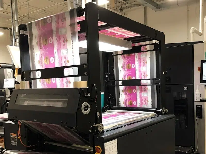
- Small-batch digital sample. Order 50–200 digitally printed pouches with real film and finish. Screen color rarely matches printed CMYK on matte BOPP — see Pantone’s notes on screen-to-print shift.
One pet food client we onboarded in 2023 caught a critical issue at the blur stage: their navy logo vanished against the retailer’s dark wood shelving. A two-shade lift saved roughly $9,000 in scrapped plates.
For sourcing partners that support digital sampling before gravure commitment, see our 2026 stand up pouches manufacturers guide.
Common Custom Pouch Design Mistakes from 300+ Client Projects
Across more than 300 custom pouch jobs since 2015, the same six mistakes account for roughly 80% of pre-press rejections at GCLPacking. They’re really predictable, and honestly avoidable if you know where they tend to hide inside the stand up pouch design file.
The recurring failure patterns
- Text sitting inside the approximately 8mm seal zone. A pet food client placed feeding instructions just 4mm from the bottom gusset edge. After heat sealing, half the text got crushed inside the weld. The fix is simple. Pull all live copy approximately 10mm inboard from every seal line.
- Barcodes scanning at approximately 60% reliability on kraft. The fibrous texture of natural kraft basically scatters laser light all over the place. We now print barcodes inside a white knockout box, minimum approximately 30mm wide, with bar height at approximately 25mm. Scan rate jumps to approximately 98% + per GS1 print quality guidance.
- Gradient banding on PCR film. Recycled plastic films coming back from consumers have uneven surface tension, so smooth gradients end up showing stepped bands. Replace gradients with scattered noise patterns or flat spot colors instead.
- Oversized windows weakening seal integrity. A coffee client wanted a approximately 60mm-tall window starting just 5mm above the bottom gusset. Drop tests at 1.2m failed 4 of 10 units. Reducing window height to approximately 40mm, then raising it approximately 20mm above the seal, completely eliminated the failures.
- CMYK black on dark backgrounds printing muddy instead of looking rich. Expected level rich black is essentially C40 M30 Y30 K100, never 100K alone.
Pricing Drivers, MOQs, and Lead Times for Custom Stand Up Pouches
Direct answer: For a custom stand up pouch design printed on rotogravure, expect five cost drivers in this order of impact, order quantity, color count, material structure, finish/special features.
And plate fees. A typical 8-color gravure plate set runs approximately $80 approximately $150 per color (one-time).
So a full wrap can add approximately $800,approximately $1,200 in tooling before a single pouch is printed.
What actually moves the unit price
- Color count: Jumping from 4-color to 8-color gravure adds roughly 12–approximately 18% to the unit price and doubles plate cost.
- Structure: A recyclable mono-PE laminate costs 8–approximately 15% more than standard PET/PE at equal thickness, mainly due to film how much usable material is produced loss.
- Finish: Soft-touch matte varnish adds about $0.01–approximately $0.02 per pouch; spot UV or cold foil adds approximately $0.03 –approximately $0.05.
- Quantity tier: Moving from 5,000 to 30,000 units typically drops unit cost 22–approximately 30% as plate amortization spreads.
MOQs and lead times at our Chongqing facility
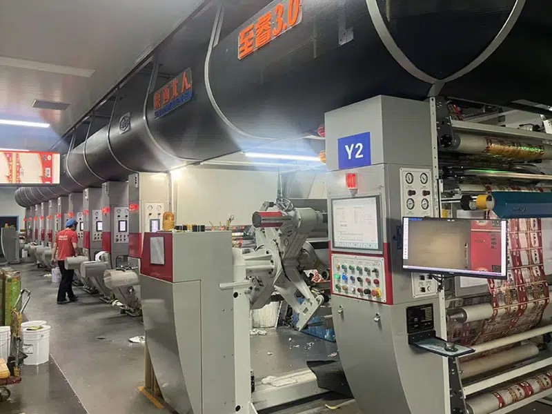
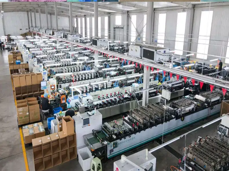
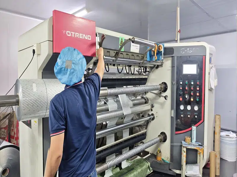
At GCLPacking’s BRC- and FDA-audited plant, gravure MOQ starts at 10,000 pouches per SKU; digital print drops the floor to 3,000 for sampling runs or limited editions. Typical timeline: 7,10 days for printed pre-production samples, 5,7 days for gravure plate-making (concurrent with film procurement), then 15,20 days production.
Total: 30,40 days door-to-port. Air-freight samples ship within approximately 48 hours of approval.
Rotogravure economics are explained in detail by Wikipedia’s rotogravure entry.
Frequently Asked Questions About Stand Up Pouch Design
Can I design my own stand up pouch online without a designer?
Yes for simple layouts, no for retail-grade work. Free tools like Canva and Adobe Express can produce a flat PDF, but they output in RGB at 150 DPI and lack CMYK color profiles, spot color channels, or white-ink layers that gravure and flexo presses need.
Expect a 15-approximately 25% reprint risk on first orders done this way. For a stand up pouch design heading into a grocery chain, hire a packaging designer or use your printer’s in-house art team.
What template files do printers actually accept?
Adobe Illustrator (.ai) and high-resolution PDF/X-4 are the two universal formats. We reject PSD files at GCLPacking because raster-only artwork loses sharpness on barcode and small type. Send the dieline as a separate layer with spot color swatch named “Dieline” set to overprint.
How small can MOQ go for custom kraft pouches?
Digital printing on kraft starts at 500 pieces; gravure-printed kraft typically requires 10,000+. GCLPacking runs digital kraft from 500 pieces for new brands testing flavors.
How long from artwork approval to delivery?
18-25 days production plus 25-35 days sea freight to the US West Coast. Air freight cuts transit to 5-7 days at roughly 6x the cost.
What photo resolution do matte pouches need?
300 DPI at final print size, minimum. Matte lamination scatters light and exposes pixelation that gloss would hide, see Printing United Alliance resolution standards.
Turning Your Design Brief Into a Shelf-Ready Pouch
Quick answer here: take every decision from this guide and boil it down onto a one-page checklist that your brand team, your designer.
And your manufacturer can all sign off on before the tooling fees start showing up. Skip the checklist and you’ll honestly burn through 2-3 weeks on revisions that really should have been settled back in the brief.
The One-Page Pouch Design Checklist
- Outcome goal, basically define the one shelf measurement that matters (3-second recognition from 1.5m away, the perception of being a premium-tier price, or that e-commerce unboxing moment). Pick one goal, not three.
- Shape and size, the gusset type should match what the retailer’s planogram allows, and the fill weight needs to be tested so the center of gravity stays stable.
- Material structure, PET/PE works if your shelf life runs over 12 months, or recyclable mono-PE if you’re chasing the EPA recyclability guidance or trying to comply with EU PPWR rules.
- Finish and closure, matte, gloss, or soft-touch should tie back to the category cue, and the zipper or spout has to match how people actually consume the product.
- Dieline prep, approximately 5mm bleed, CMYK plus spot colors all specified, barcode sitting inside the quiet zone, and fonts outlined.
- Validation step, run a 5-second recognition test on at least 30 of your target shoppers before anyone starts making plates.
What Happens Next
Once you’ve locked the checklist down, ask your manufacturing partner for three things in this order. First, a free dieline template that’s sized to your fill weight.
Then two physical pre-production samples (one matte, one gloss, which is genuinely the cheapest A/B test you’ll ever run). And finally a written quote that covers plate fees and minimum order quantity.
And lead time too. At GCLPacking, the dieline turnaround generally runs 24-approximately 48 hours and the unprinted samples ship within 5-7 days from our facility in Chongqing. That’s fast enough to actually validate your stand up pouch design before you have to commit to the 8,000-unit rotogravure minimum.
Still comparing suppliers? Have a look at our 2026 manufacturer shortlist before you start sending out RFQs.